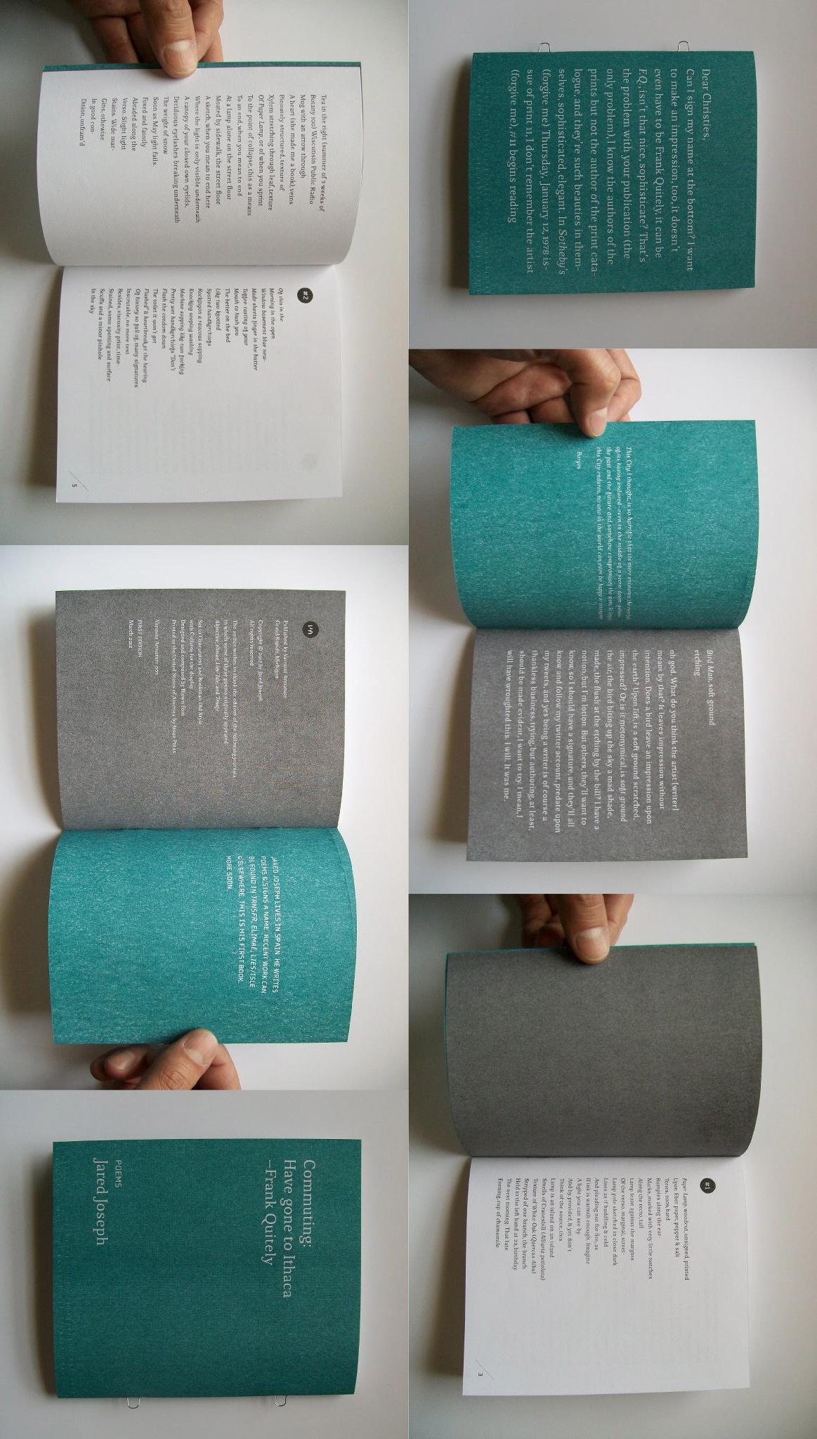
Typeface #54
The type used to set this book, Sognidhia,
was created by an obscure order
of Florentine nuns in the 16th century.
Living in close quarters, the sisters designed
Sognidhia in italics to evoke intimacy
and an inclination to bend to God’s will.
The ascendant letters (l, k, h, etc.)
slenderly loop, while those
with bowls (a, q, o, etc.) ellipse.
Sognidhia is traditionally printed
in lower case as a nod
to modesty and inconsequence.
Dense, but with room to breathe,
Sognidhia bears a sharp serif
and survives in modern times
as the choice of writers who seek
both to atone for and to glorify
the shortcomings of their work.
*
Typeface #68
Of all the typefaces in the Dardont family,
Dardont Modern appears most insecure.
The downstroke sags; its thin bones
visually shiver against the vast white.
Between the lines, the ghostly questions:
Is my aim true?
Can
I fill the void?
When will I build
my exquisite city?
More poetry at Used Furniture.


“When will I build / my exquisite city?” Are you kidding me? I want to have written that ending. I want to have written that whole poem. Hell, I want to have written both of these. I don’t see any shortcomings here.